The United Nations General Assembly has adopted a resolution called “Correct the Map,” calling on the world to abandon the Mercator projection, the map most commonly used in classrooms, on Google Maps, and on TV screens worldwide. The problem: the 1569 map, created by Flemish cartographer Gerardus Mercator to help sailors navigate by compass, distorts the true size of landmasses. Because it stretches regions farther from the equator, it makes Africa look roughly the same size as Greenland, even though Africa is actually about 14 times larger.
Experts say this isn’t just a technical quirk. Kenyan geographer Kioko Muendo argues that shrinking Africa on maps has long downplayed its true scale, resources, and economic potential in the eyes of the world. In response, the UN has endorsed the Equal Earth projection, a map developed in 2018 that more fairly represents land area and was already adopted by the African Union earlier this year. Its trade-off: it can’t be used for precise navigation or distance measurement, since no flat map can perfectly preserve area, shape, and distance all at once.
Other alternatives, like the 1970s Peters map, have tried to solve the same puzzle with their own compromises, distorting shapes to preserve scale. As cartographers explain, every map ultimately involves choosing what to sacrifice.
Curious how these different maps stack up? Read the full original report from the BBC for more.
Source: What different world maps get right – and what they get wrong (feeds.bbci.co.uk). English version produced with AI assistance.
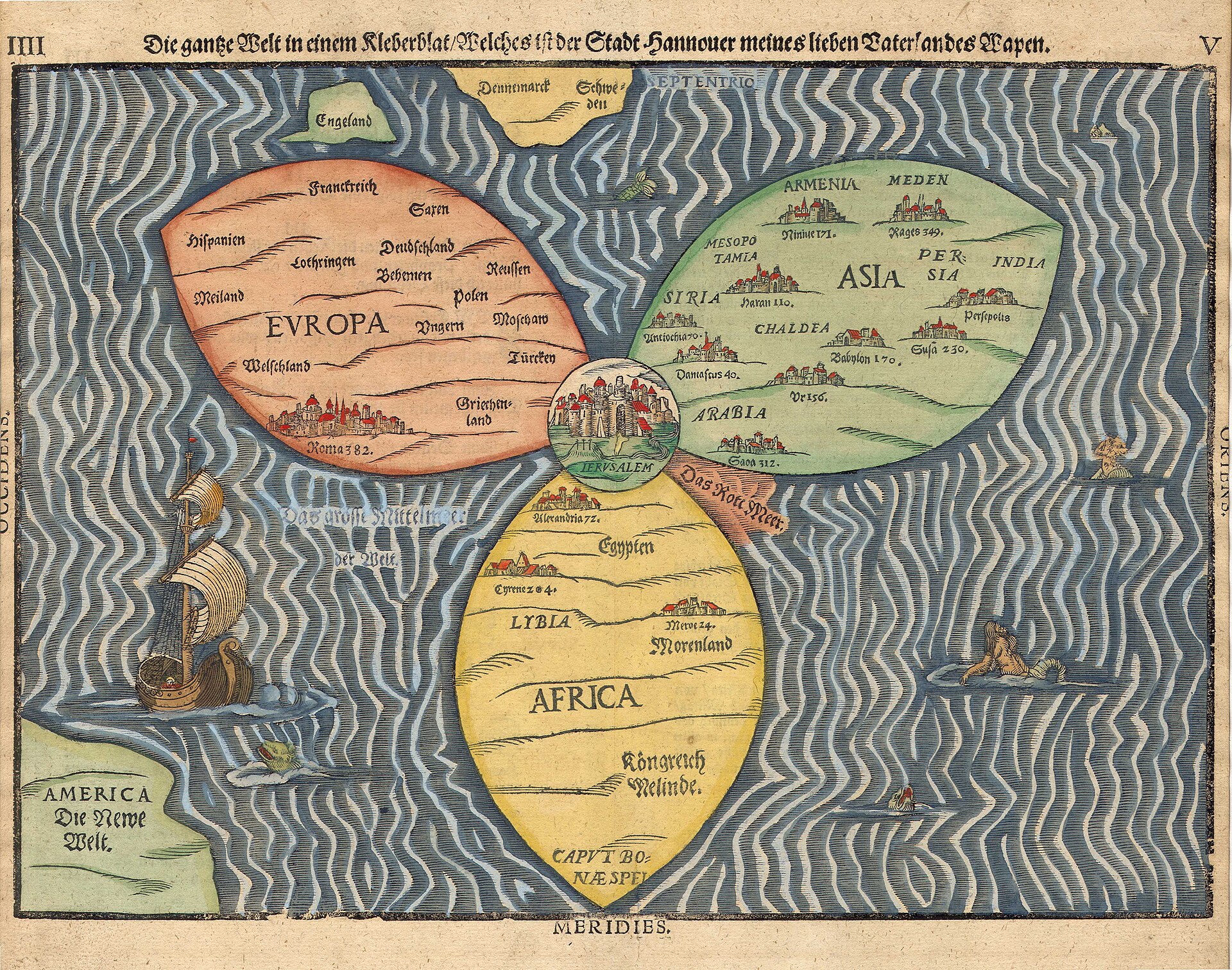
Image: Heinrich Bünting.